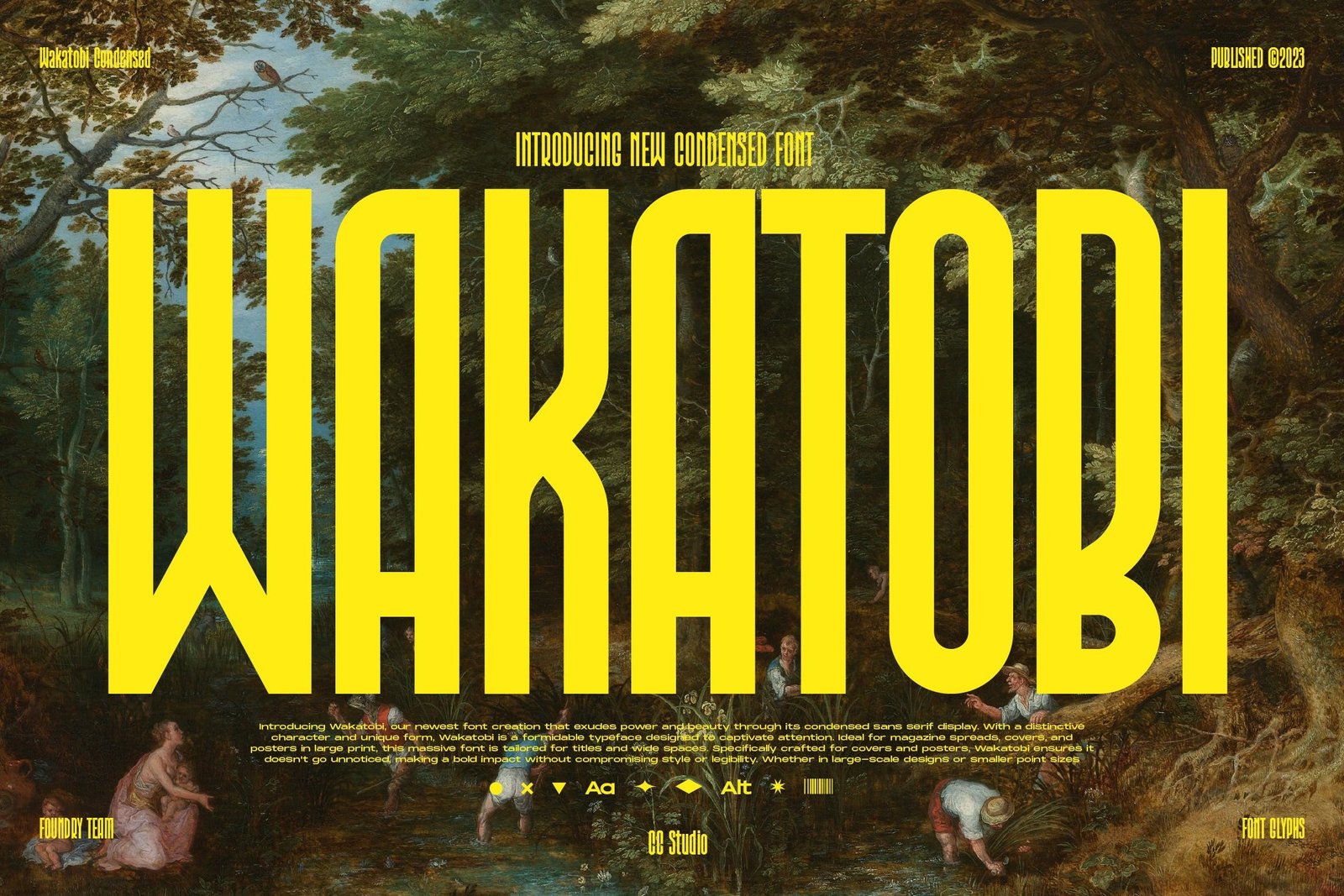
Wakatobi is a newly designed font that aims to convey power and beauty through its condensed sans serif display. It is specifically created to make a bold impact and capture attention in various design applications, particularly for magazine spreads, covers, and posters in large print.
Key Features:
Distinctive Character and Unique Form:
Wakatobi is characterized by a distinctive design that sets it apart from other fonts. Its unique form adds personality and visual appeal.
Formidable Typeface:
The font is described as formidable, suggesting a sense of strength and impact that it brings to the visual elements it is used for.
Tailored for Titles and Wide Spaces:
Wakatobi is optimized for titles and wide spaces, making it well-suited for use in magazine covers, posters, and other large-scale designs.
Ideal for Covers and Posters:
The font is specifically crafted for covers and posters, ensuring that it stands out and makes a bold statement without compromising on style or legibility.
Versatility in Design:
Whether used in large-scale designs or smaller point sizes, Wakatobi is designed to stand out and deliver a visual punch that combines impact with elegance.
Additional Features:
Stylistic Alternates & Ligatures:
The font includes stylistic alternates and ligatures, providing designers with additional options for customizing the appearance of text.
Format Files:
Available in TTF (TrueType Font), OTF (OpenType Font), and WOFF (Web Open Font Format) file formats, offering compatibility for various design applications and platforms.
How to Access Alternate Characters:
To access the alternate characters in Wakatobi, follow these steps based on the design software being used:
Adobe Photoshop:
Go to Window -> Glyphs. This will open the glyphs panel where you can explore and select alternate characters.
Adobe Illustrator:
Go to Type -> Glyphs. Similar to Photoshop, this will open the glyphs panel for you to access and choose alternate characters.
Wakatobi appears to be a versatile font with a focus on making a strong visual impact while maintaining elegance and legibility. Designers can explore its stylistic alternates and ligatures to enhance their creative projects.
